

Aerochrome Emulation
Aerochrome Emulation
Kodak Infrared Ektachrome, also known as “Aerochrome” is an infrared sensitive film originally made for air reconnaissance. It’s ability to highlight organic plantlife was also great at highlighting artificial camouflage.
That all being said though, The images you see on this collection are not Aerochrome, they are emulated, in otherwords they are made to look like the film stock as closely as I can. But as you look though this collection I will highlight some interesting facts about the legendary Aerochrome and its history! so follow me on my journey to make cool aerochrome photos without spending hundreds of dollars to aquire the original film stock!
As a reminder, these images are not shot on real Aerochrome, they are emulated to look like they are. And this collection is overall meant to educate on how to shoot aerochrome
Most of the images you see here are not shot on digital but are still shot on film, the only difference being I am shooting on mostly Color Negative Film like Gold 200 and Portra 400 and Graded to look like Aerochrome. With that in mind, this explains the discrepancy technically between the real film stock and the images you see here.
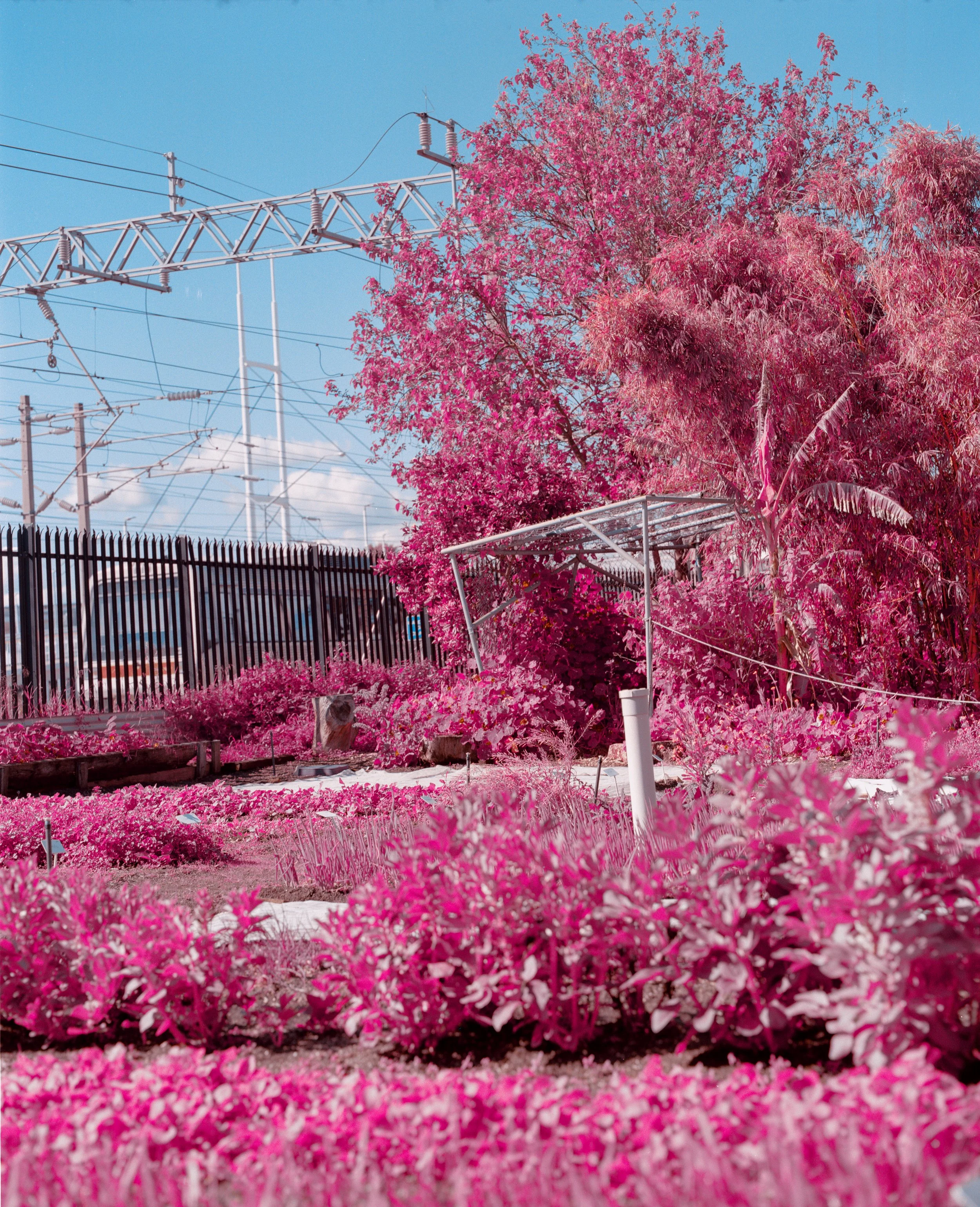
| Green Filter
| Orange Filter
First of all let’s look at our Datasheet, More specifically our Spectral Sensitivity. Mow the most interesting thing here is our Cyan layer going way over 700nm. Most film stocks like Portra 400 have their individual dye layers dip just before the 700 mark similar to what you see with the magenta line here. so from this chart, we can come to the conclusion that our photos would be very blue, as Jason Kummerfeldt would say “Bluer than a blueman’s ass from the blue man group”.

But what is this graph anyways?!?
what’s so important about it that I needed to bring it up?
Infrared light is between 780nm to 1mm. everything below that is our visual spectrum and then ultraviolet
In other words, our Cyan layer is sensitive to Infrared
The astute among you might ask: “But if this film is what you say it is, the image would come out as a positive, why is it that these images are red/orange or even pink?”
Put simply, a blue image isn’t really that informal, let alone artistically awesome.
So when you shoot Aerochrome, it is highly recommended to shoot it with a filter, more specifically an Orange/Red filter to get those heavy reds, a green to get those bright pinks, and yellow to get a darker red or a bright pink. these colors also are affected by the amount of light hitting the subject, so back-lit subjects don’t look that good whereas full daylight will give desirable results